For the first construction of our music video we used 'iMovie', 'Photoshop'. We also used 'Garageband', 'Digital camera'. Lastly we used 'iTunes' to get our chosen song for our video.
For the planning aspect of our video we used 'Safari' and 'Youtube' to research other music videos to gain ideas from other students work and also professional videos. We did this so our work could get the highest grade possible.
Lastly we used social networking sites such as 'Facebook' for evaluation, as well as 'Youtube'.
iMovie
We used iMovie to edit and put together our music video.
Using this on iMovie I could adjust the duration of a clip and also the speed of it to fit in with the music.
Another section on iMovie is the audio adjustments section, this allows me to change the speed of a the song, faster/slower and also other slight adjustments e.g. fade in/out for when there may be speech or other sound effects.
iMovie also has a section that stores sound effects, your own music and iMovie sounds. This allowed me to access various different sounds created by iMovie which could help me in creating the video. Also by storing my chosen song on the system I could constantly change it, save it and use again.
This section allowed me to add transitions in between different clips to break it up slightly.
Photoshop
This toolbar on Photoshop allowed me to easily access the different tools I wanted to use to create my poster/digipak. For example, the 'T' (text tool) enabled me to add text to my poster, the album title etc.
The magic wand tool (as shown) allowed me to quickly select the outline of an image to delete it all and simply keep the object/person I wanted. This creates smoother lines than the eraser tool as it automatically finds all the background parts but distinguishing the different colours.
(AS SHOWN BELOW)
Youtube
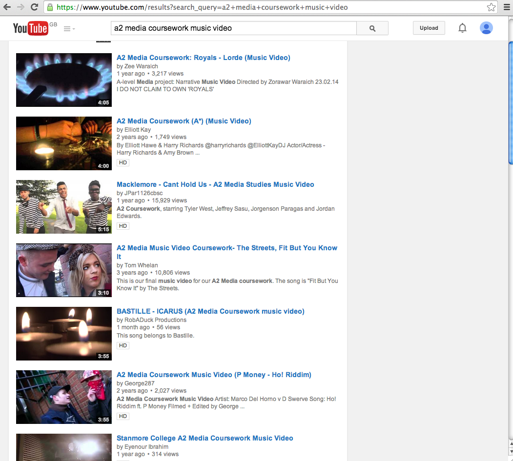
I used Youtube to research other students work to gain ideas, I spent a whole lesson looking at all style models to broaden my knowledge on music videos as I had no previous experience.
Facebook
We used the Facebook application to post pictures of our poster/digipak and our video to get audience feedback on what they liked/didn't like. We used these comments to make our project better.
Monday, 20 April 2015
Saturday, 18 April 2015
Question 3- What have you learnt from your audience feedback?
I used Facebook as a way of getting audience feedback, ideas and it also helped me realise how important audience feedback was to make my tasks look more professional. I decided to use Facebook as it is like a large virtual community where all my friends and family can see what I post allowing me to be able to get as much accurate feedback off people as possible.
When posting these images of my Digipak I asked everyone the things they liked/disliked about the Digipak and and suggestions for improvement so the quality of my products could be at the highest standard.
During this time people told me things that I had not noticed myself that could be added or changed such as having the price on the Digipak cover.
As well as these suggestions I also received a lot of positive comments about my Digipak which gave me and my group a big boost because we've all worked together on the video.
When posting these images of my Digipak I asked everyone the things they liked/disliked about the Digipak and and suggestions for improvement so the quality of my products could be at the highest standard.
As well as these suggestions I also received a lot of positive comments about my Digipak which gave me and my group a big boost because we've all worked together on the video.
Friday, 17 April 2015
Question 2- How effective is the combination of your main product and ancillary tasks
All three products made including the video fit well together as a pack for my A2 coursework because of the similar features on all products.
Digipak
The consistent use of the same colours on the Digipak (black and white) represent the unhappiness of both actors as they just can't find each other again so at first they are sad and frustrated. The back of my Digipak is in colour which represents the happiness at the end (the back) once they've found each other and its more a relaxed feel that I want my audience to be apart of.
The main image used on the front cover is the two characters back to back, to show the main idea of the film, that they are constantly searching for each other, looking different ways but all along they're right behind each other so I chose to use this kind of image so the audience can also understand.
I used word 'Irrevocable' because of the fact they are both irrevocably in love with each other and being apart is hard for each other hence why they're both searching until they find each other again because they don't want it to be the last time.
Poster
My magazine poster follows the same conventions used on other popular music magazines such as 'name' 'price' and where to buy etc.
1.) When researching different music posters I noticed a lot of them had close/mid shots that drew in the audience and made them feel 'closer' to the band. The reason I used the same type of shot for my characters is because I wanted the audience to bring their attention to them and when people are familiar with that person they will be more inclined to buy it. One technique that I took from different style models was splitting the characters apart, this is showing opposite sides and that they're constantly looking the other way for each other.
2.) The text size was extremely important to me as I had seen other music posters where the text size was too small for my viewing and it ruined the whole thing for me so I didn't want the same thing happening to my poster. The largest text I wanted was the title of the band and the name of the album. When looking at my style models such as 'Kerrang' and 'Smash Hits' you firstly see the main image and then your attention is diverted straight onto the title so this had to be big and bold. I set out the image in line with the title so they could be seen in comparison with each other.
3.) Colour was also important to me and keeping it all the same so that it was consistent throughout and black and white seemed like a good choice to me because it represents sadness and lost which is what both actors are going through.
Thursday, 16 April 2015
Sunday, 12 April 2015
Updated front cover
I have updated my front cover digipak a little bit by adding in the band name so people know who it is.
Video Completed
We have finished our music video completely, at the end of the video the two actors finally meet as shown by the joining of their shoes, after this major key parts of the video are repeated as a way of looking back on the times they missed each other and to remind the audience as well.
It is also repeating to show that this happens a lot every day around the world, people missing their 'soulmate'.
The end is showing the two of them walking out of the park together, showing that they have met and are now together.
It is also repeating to show that this happens a lot every day around the world, people missing their 'soulmate'.
The end is showing the two of them walking out of the park together, showing that they have met and are now together.
Saturday, 11 April 2015
DigiPak cover update
This is an image of my most recent Digipak cover.
I have included the song on the front image that our video is as its the main song, by putting it on the front cover it can attract everyone whose heard the song but maybe not necessarily heard of the group.
Also i've added our groups logo in the top right hand corner, which is something that is going to go on all of my projects for this coursework so people can get used to it and instantly know who it is.
Friday, 10 April 2015
Chosen Image
I have chosen to use this image as the front cover of my Digipak, I have chosen this one because I like the stance that both actors have, they are looking straight ahead, no talking etc, like that can be saw in others.
The lighting is better in this image as its more natural rather than shaded on someone's face etc.
Digipak Back
These are a few images of different digipak backs that I have been looking at for inspiration for my own.
I like these ones in particular because of the plain backgrounds which is the look I would like to go for, I dont think I need a lot of pictures/editing on the back because it is mainly for the songs on the album.
I have chosen to use this Ed Sheeran album back cover as my style model for my own digipak back.
I think the close up shot of Ed is very appealing and interactive in a way with the audience, the small logo on the side tells the audience who it is as well as the image. The close up shot is intriguing and interesting, this is what I would like to do myself.
Thursday, 9 April 2015
Digipak Back
I needed an additional fourth image for my digipak to go at the very back as it has 4 panels, using my audience feedback as well which was adding the price in somewhere I decided to add it here as it is usually either on the back or the front of the album.
Tuesday, 7 April 2015
Half Term
We have just returned from our easter break off and now in out final weeks to finish our music video and supporting projects.
This lesson I am going to be starting to work on my Digipak front cover now we've got pictures suitable for this.
Monday, 6 April 2015
Digipak
These are a few photos for my Digipak that I took, I now need to decide what ones I am going to use.
Wednesday, 1 April 2015
Filming and Pictures
Today after school myself, Kayleigh(recorder) and Rhyce (actor) will go to the park to finish our second to last scene, we are hoping that this is the last day we will need to record because of our tight schedule. After the park scene is finished we are heading back to the train station to start our finishing scene which should hopefully not take long.
Once we have finished this filming we can begin to edit it and put together the video.
Subscribe to:
Posts (Atom)